Tableau Training | Tableau Certification Course | OnlineITGuru
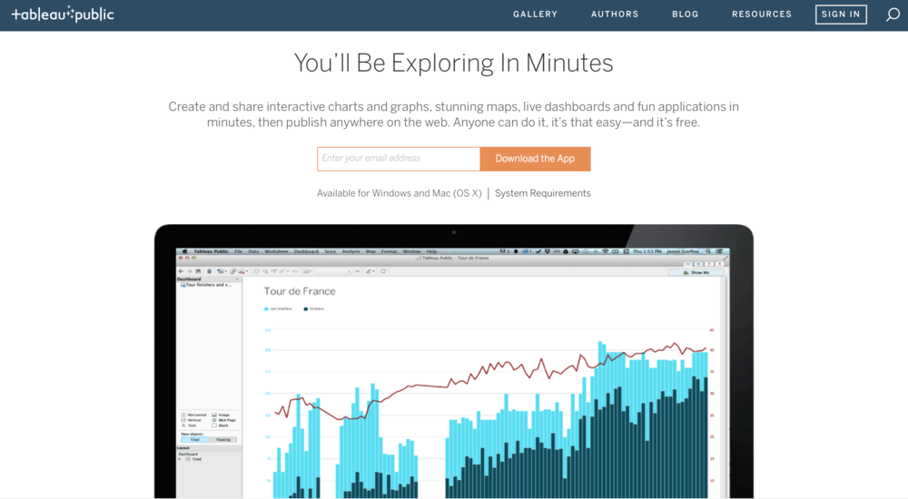
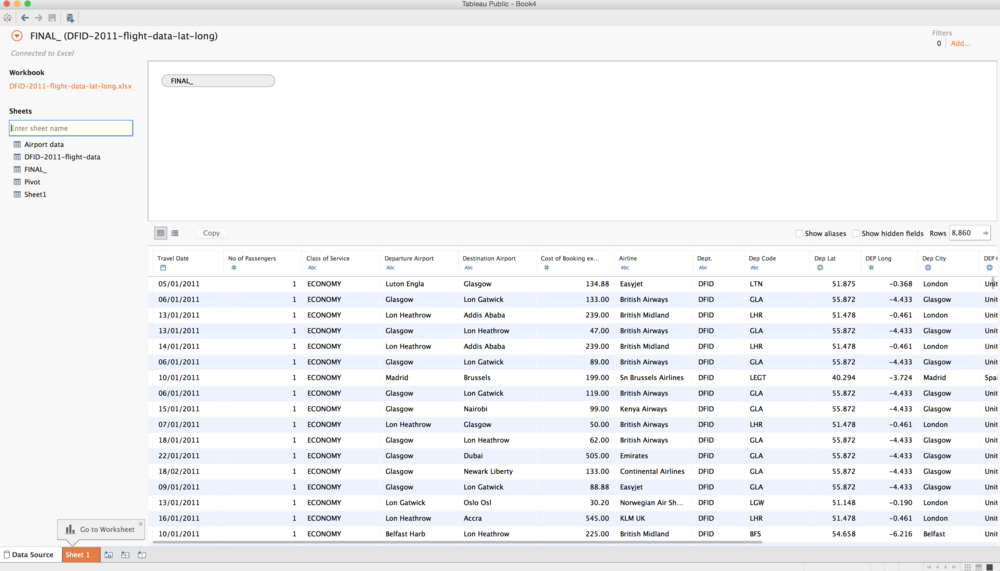
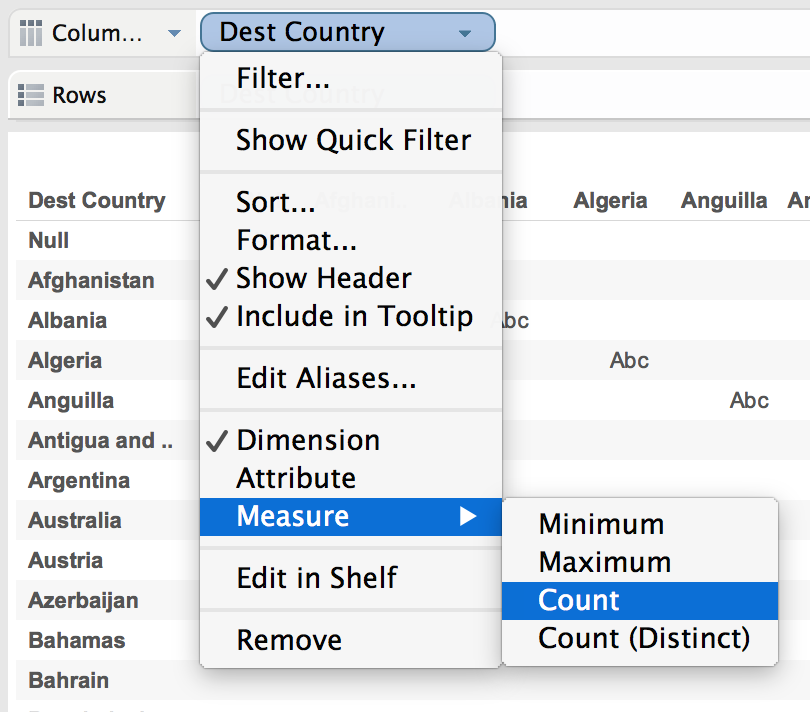
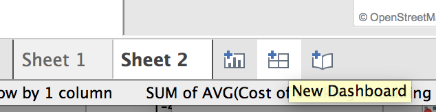
Building dashboard with Tableau server Tableau is a software for quick-fire business intelligence that allows you to take decisions at a very fast pace. Tableau is a leading new-generation Business Intelligence ( BI) application that is also referred to as a "self-service" data discovery tool as it can be achieved with virtually no IT support. This software shines as a graphical tool or visualization tool, where you would have relied on a number of other tools to represent the bar charts or pie charts for longer durations. Tableau server is designed to perform, and provides very fast visual analysis. Tableau server is best suited for creating quick view dashboards to check for the details that are most needed and may drill the data down to further levels based on the requirement. Tableau Dashboard A Tableau dashboard is a collection of multiple views, allowing simultaneous comparison of a variety of data. For example, if you have a set of views that you review on a daily basis, you can create a dashboard that displays all views at once, instead of browsing separate worksheets. You can access dashboards from the tabs at the bottom of a workbook, just like worksheets. The data in sheets and dashboards are connected; any dashboards that contain it change when you modify a sheet, and vice versa. Both sheets and dashboards update from source with the latest data available. Deploying Tableau server Dashboards Step 1: Download Tableau server Public. Then install it and create an account If you haven't already done so, download Tableau server Public to your computer and install it. You will also need to create an account as part of that process, and to save and share your visualizations. To access the program, you will be required to enter your email address. If you've already installed Tableau server Public but haven't checked it in a while, it's worth noting that Tableau server 9 was launched at the beginning of April. Therefore, the most current version might be worth installing. Step 2: Connect Source Data The first thing you'll need to do after you open the program is to connect to the data. Click the battery-like icon (I think it should represent a server stack but your guess is as good as mine) with a plus sign on the bottom. A drop-down menu pops up. In Tableau server Public, just like an Excel spreadsheet, you can connect to offline data sources. With the paid version, the connection to dynamic data can be made. In this case, you will use an Excel spreadsheet to work with. You are using the same data as before: 2011 DFID flights which can be downloaded as a Google Spreadsheet. Once you have selected the corresponding sheet, click the tab in the bottom-left corner to start exploring your data. STEP 3: Moving 'pills' to rows and columns to create new tables and charts The first thing you may like to see is the amount of times DFID employees traveled to different countries. You know that from PivotTables already, but this will just be one aspect of our dashboard. The thing that Tableau server needs to know is that it's designed to be a 'drag and drop' interface. Specific measurements and proportions may be dragged directly into columns or rows in the left sidebar but also to adjust colors or sizes. They take the form of a stretched oval when pulled through these areas, which is why they are known as 'pills.' Let's begin by dragging into the rows of our 'Destination' dimension. It automatically generates a table which is not unlike a PivotTable. You may drag the same metric, 'Dest Nation' into the field of columns to get a count of the number of visits to each of these nations. This produces a table you do not want to have. But never worry! This is because it treats it more as a 'dimension' (i.e. discrete categories, such as Afghanistan and Bangladesh) than as a measure. If you click the 'Dest Country' pill in the field of the column a dropdown menu appears and you can change it to a count of the measures. This will generate a bar chart, which you will be able to filter down by clicking on the 'Sort down' button at the top of the page. You'll also note a variety of different styles of charts are available in the 'Show me' menu. By clicking on the one in the top-left corner, you get a list, which is how I'm going to leave this for now, as you just want an overview in the dashboard that you'll make. Step 4: Build a sheet which can act as a filter Some of the good things about the dashboards is that they would be able to communicate with individual panels. One way of doing so is by filtering. Because this dataset contains a lot of country information, you can map the countries, and then use it as a dashboard filter. To do so, drag the 'Dest State' dimension into the field of columns. Pick the map icon filled out in the dropdown 'Show me.' You can then make a choropleth, or fire map using this. Perhaps you want to know , for example, which country cost the most on average to travel to. If you drag the 'Cost of Booking' measure onto the 'Color' shelf, the map will change color to show how much DFID has spent traveling to each country. But that's a complete outlay. Changing it to the average spent per country for visualisation purposes might make more sense. To do this, you pick the 'Sum(Cost of Booking) pill' and change it from a sum to an average in the drop-down menu. The result is a map depicting Mali as one of the most expensive places to enter. The data has a certain oddity. Somebody seems to have reimbursed a trip to Colombia, and that may have happened over the financial years. So let's rule this out. Just click on Colombia, then select 'Exclude' to sort the map. Step 5: Build interactive dashboards Instead of creating a new sheet, click the button at the bottom of the sheet to create a new Dashboard. You will see that in the left sidebar of a dashboard, you have the sheets instead of individual variables. Let's just drag one sheet onto the page, then sheet two below it. Then, pick 'Sheet 2' and you will see a grey border. On the top-right corner, select the little down arrow and a dropdown menu will appear. Pick 'Use as filter' click. Now, if you select a country, the chart at the top changes to display that country only. It is not the prettiest of Dashboards as it stands. But it has the potential with a bit of tidying up, and adding some more measurements! Conclusion I have tried in this article to send you a brief overview of Tableau server as software can provide to you or to your organization. In addition to those details, you have provided the necessary information on how to create new Tableau server dashboards, and how to use the newly created dashboard for faster access to data. Hope this article is sufficiently insightful to provide you with all the necessary details for quicker references at one location. You can learn more through Tableau server online training.